


Paulina Ryt • Graphic Design • 2025

Hello I'm Paulina!
(But most people call me Paul.)
Visual communication has always intrigued me. It is a universal language, one that as a designer, I love to decode like an intricate puzzle. I strive to find overlap in creative collaboration and that's where things tend to spark! The more I design, the more I learn how to communicate even the most complex concepts with simple solutions. I hope to get the opportunity to do so for you.I've been hunched over my computer designing graphics for about 9 years now, graduating in 2020 with my BA in Graphic Design from Columbia College Chicago (Go Renegades!) My specialties include branding, social media, and marketing. Currently, I am working as a Content Graphic Designer for Rebelution, an advanced E-Commerce optimization agency headquartered here in Chicago. Join me for the ride!

Paulina Ryt • Graphic Design • 2025

Resume

Paulina Ryt • Graphic Design • 2025

Services
(Coming Soon...)
Paulina Ryt • Graphic Design • 2025

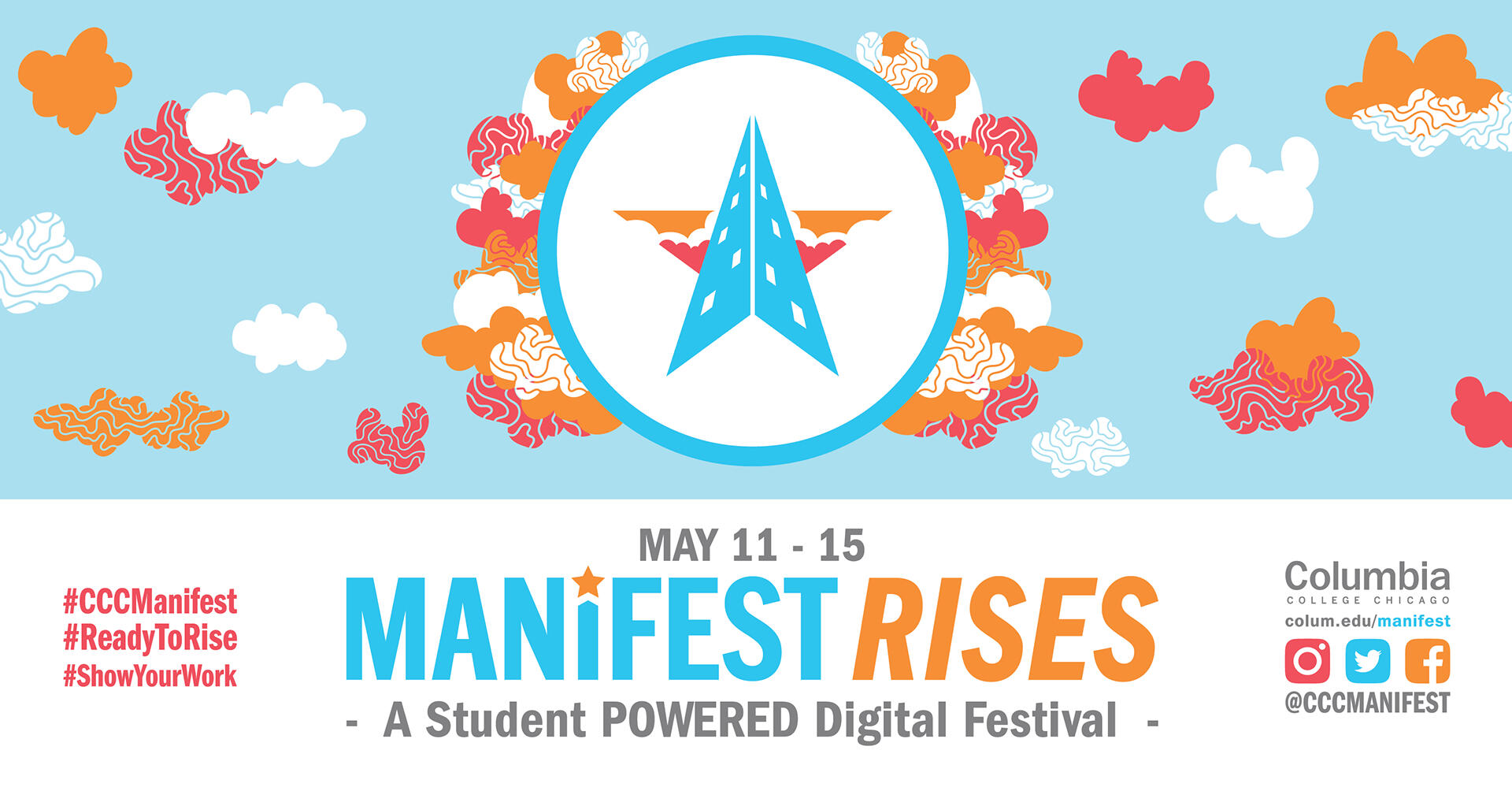
Manifest Urban Arts Festival
THE CLIENT
Every year, Columbia College Chicago put's on an annual Urban Arts Fest in celebration of a years worth of student work as well as sending off the graduating seniors. During this day-long festival, attendees experience live performances, readings, galleries, showcases, and so much more. It's a jam packed day that's looked forward to every single year.
THE PROBLEM
Creative directing Manifest meant developing a brand identity around the 2019 theme "Rise", as well as developing over 300+ print, social media graphics, merchandise, and signage materials. It's normally a 10 month long in-person project... until the global pandemic hit.Once our team realized the we were not able to have an in-person celebration, Manifest went digital and a day-long festival turned into a week-long, online, interactive festival filled with website heavy content, zoom events, and livestreams.


THE PROCESS
Planning under a new time crunch was essential to maintaining Manifest online. What was a 9 month process now needed to pivot in about 2 months, in a completely new medium, something no one had ever done before. It was intense!As a team we developed an extensive excel sheet with weekly meetings and deadlines. I quickly designed and developed unique icons for 60+ events/club web pages. I also produced merchandise to be sold through our on campus shop and shipped out to students, faculty, and parents. Lastly, Zoom backgrounds were made along with a multitude of other graphics to advertise digital attendance in classes and maintain excitement. Manifest was still happening and extending its reach.
THE RESULT
Within 2 months, we flipped an in-person festival to a digital forum filled to the brim with student work and live content. Ironically, the logo I developed months previously was a building rising up through clouds, representing Columbia's shared spaces in the middle of the city. Losing that shared space was very difficult, but we didn't let that stop us.In the end Manifest's first digital fest was a major success, extending our reach to the global scale. We had attendees from across the globe tune into zoom events and celebrating student work. It will continue to challenge future Manifests to consider how we can use social media and the website to extend online presence.View the Manifest Homepage Below:
Paulina Ryt • Graphic Design • 2025

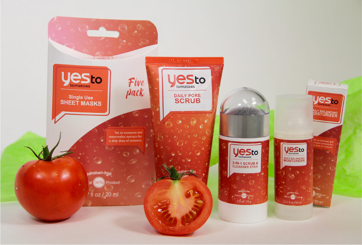
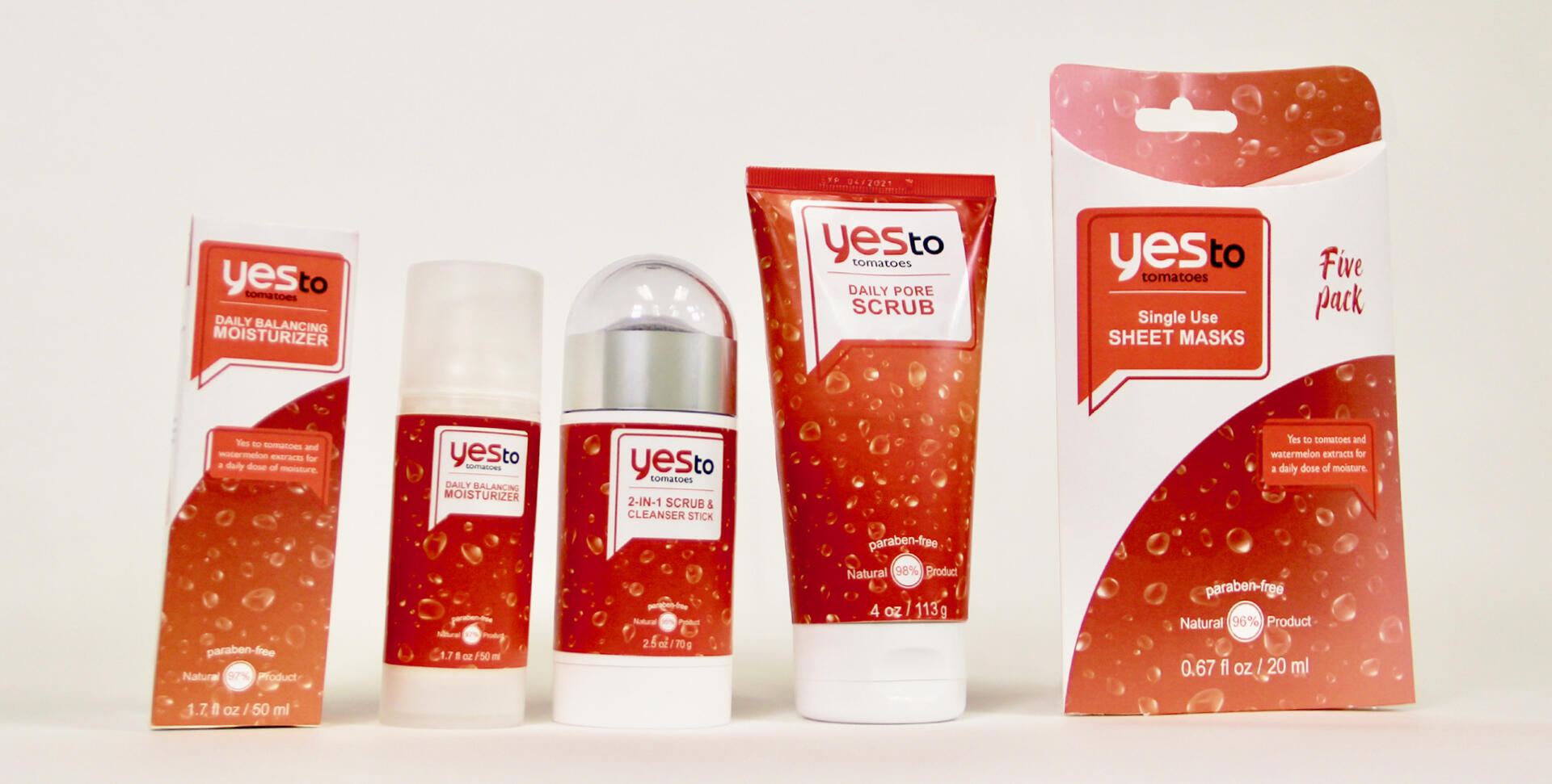
Yes To Repackaging
THE CLIENT
Yes To Tomatoes Product Line
THE PROBLEM
As a leading skin care brand focused on using clean, natural products, Yes to was in need of a fresh look. They wanted to target 15 to 20 year olds with a new take on their current tomatoes line.This hypothetical rebrand focuses on the natural textures on tomatoes and enhancing Yes to's positive mission statement!


THE PROCESS
In researching the Yes to brand, I found the tomatoes line to be one of their most popular. It is also the most approachable to a younger audience as it focuses on acne treatment. I then purchased and measured each product to get the perfect label size.Jumping into Illustrator, I developed dyelines of each product including a mix of packaging types. Lastly came printing, cutting, and assembling the line for a photoshoot!
THE RESULTS
The refreshed line retains its bright red and white color palette but adds some personality to the layout. The new packaging embraces tomatoes natural shape and firm skin.In addition to the layout, speech bubbles encase the brand's logo, calling out to consumers from the shelf. This bubbly persona falls directly in-line with the younger target audience of Yes to.


Paulina Ryt • Graphic Design • 2025

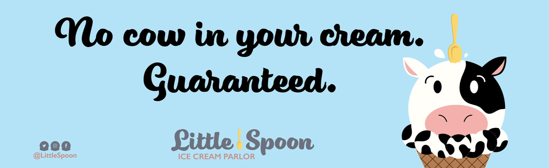
Little Spoon Animation
THE CLIENT
Vegan and Dairy-free Ice Cream Parlor, Little Spoon
THE PROBLEM
Little Spoon's an up and coming family business looking to advertise their shop on social media. They asked for a 30 second commercial that's light hearted and true to their brand's tone. They also requested a looping video catered to Instagram Stories, Snapchat, and TikTok.


THE PROCESS
I began the process with a style grid, planning out the color palette, font, and the official logo I'd be using. I proceeded to storyboard the animation, taking note of the time for each action. After Illustrating and gathering all my assets, I moved into after effects to start animating.
THE RESULTS
This cheery 30 second motion graphic piece focuses on the Little Spoon's best qualities. It uses a pastel color palette that pairs well with its upbeat and humorous tone. The animated cow and lack of cream line play off of each other as the lively spoon drops in and out of frame to start and end the video creating a perfect loop. Put it all together, and you got a sweet treat!
Paulina Ryt • Graphic Design • 2025

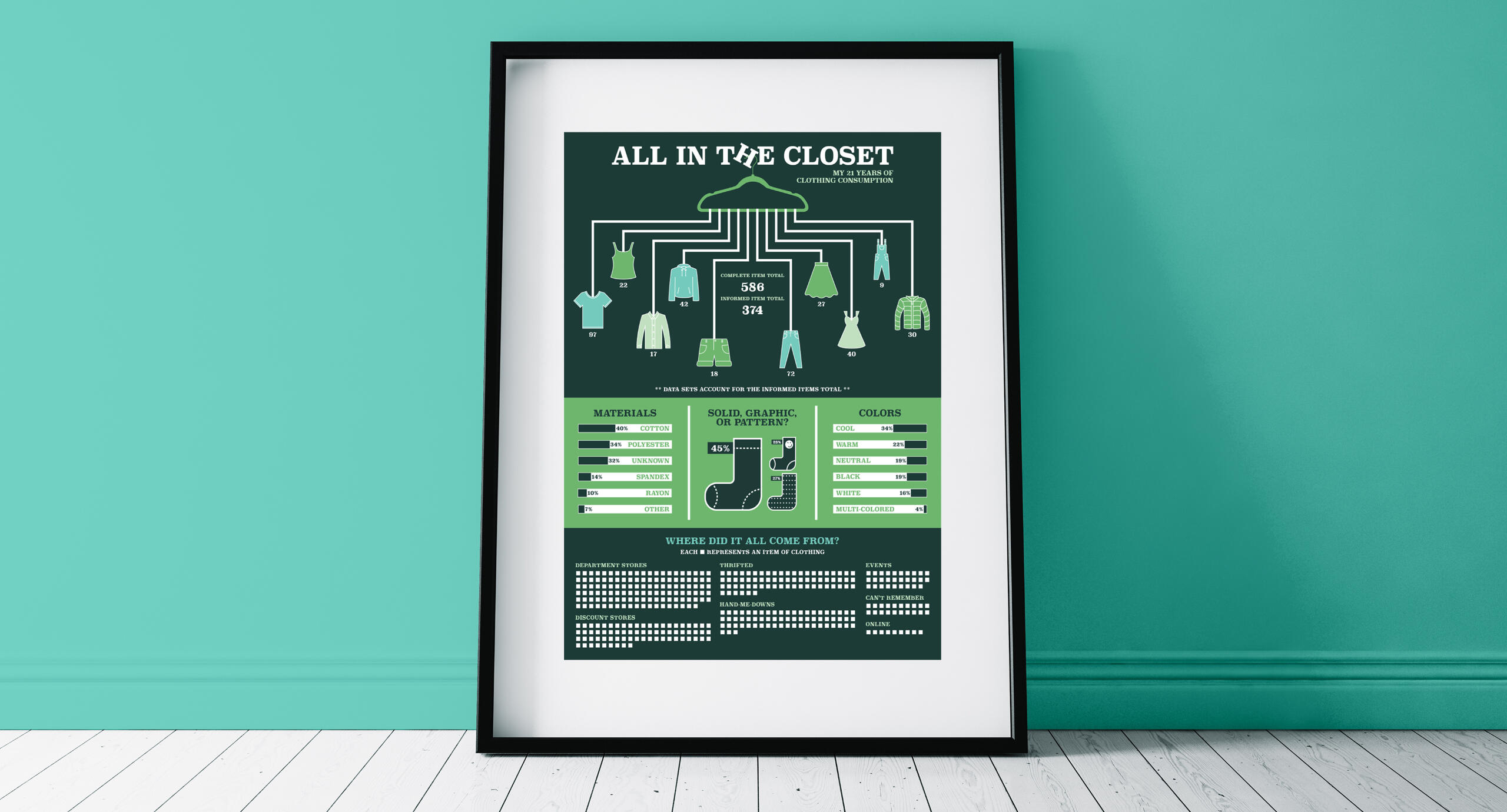
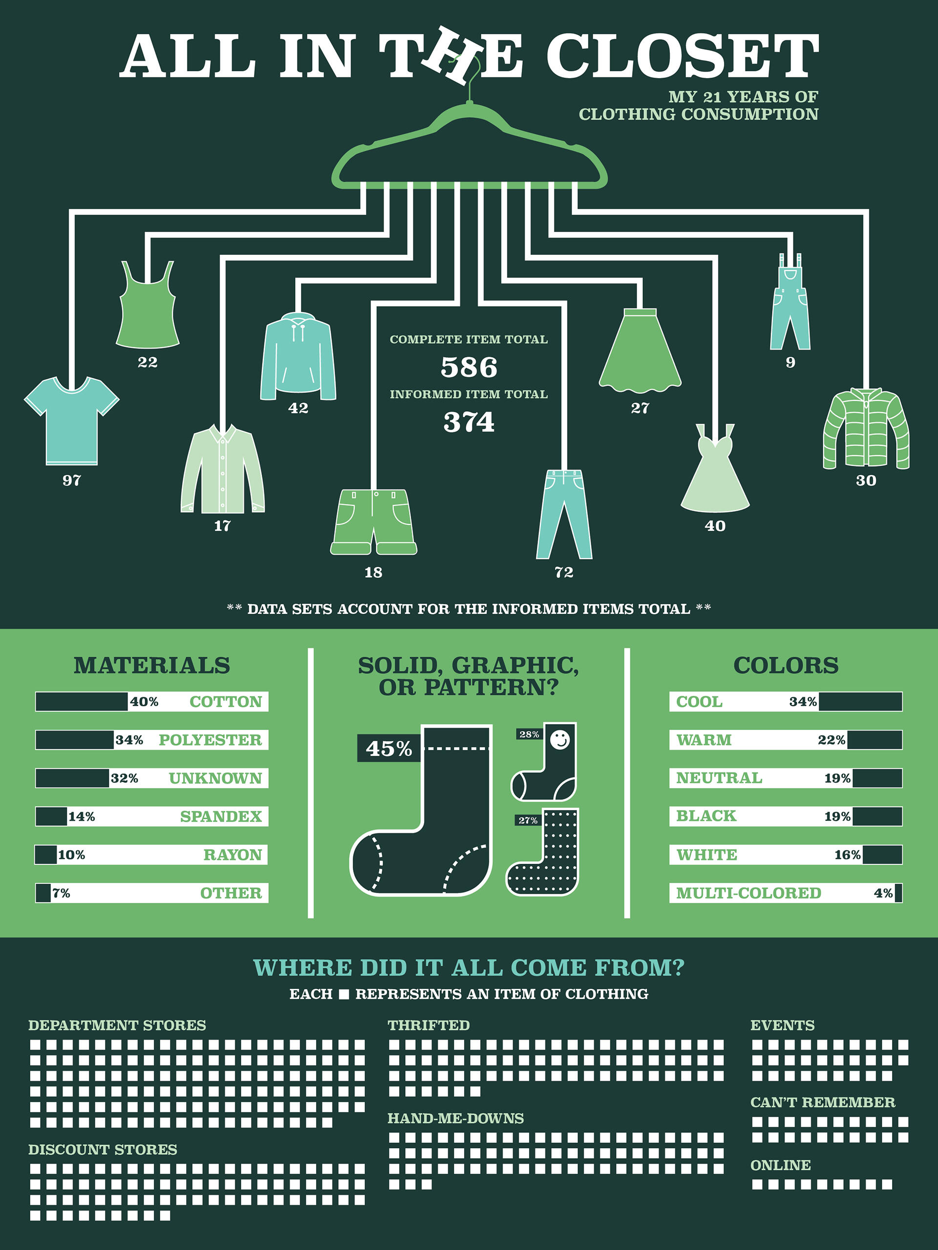
All In The Closet
THE CLIENT
My Overwhelming Closet
THE PROBLEM
My daily struggle to find something to wear has always surprised me considering the amount of clothing I'm always thrifting. I got curious one morning as to just how much clothes I had in my possession. Low and behold, the data collection began for this project.


THE PROCESS
My 21 years of clothing consumption started with counting every item of clothing in my possession as well as documenting data like color, material, where I obtained the item, and if it was a solid, pattern, or graphic.I then sketched out a quick idea of what I wanted to compare within the poster and how I would visualize that data. Developing the icons came next and finally the poster came together with some shocking results.
THE RESULTS
Overconsumption is a big problem that plagues our society especially when it comes to clothing. As convenient and trendy fast fashion can be, it is one of the largest contributors to pollution. With the creation of this 18x24 poster, I convey just how large my closet is and encourage others to consider where their clothing is coming from, what it's made of, and how they could slim down their consuming habits. This visual depiction of data helps remind me of my impact.
Paulina Ryt • Graphic Design • 2025

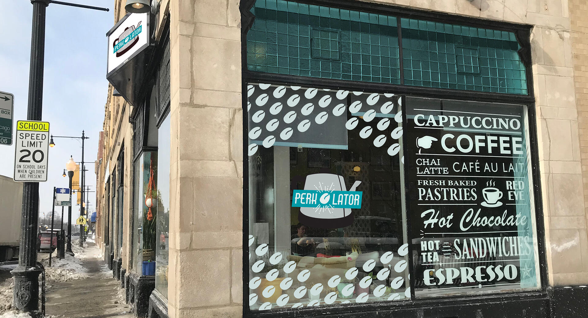
Perkolator Rebrand


THE CLIENT
Perkolator is a small local coffeehouse started in 2014 by Joe and Melissa Basilone. Since then, they have grown to be a beloved spot in the heart of Portage Park with their retro style, and homey beverages.
THE PROBLEM
What the Perkolator had in a friendly and welcoming environment, they lacked in consistent and readable branding. In furthering the growth of the company, they were looking for an updated logo, brand standards, and ideas for merchandise.


THE PROCESS
I loved being able to interview Joe and interact with the shop's product and environment for this project. Getting a feeling for the brand, I got to work developing a legible logo and color palette that matched the shop's current one. I also explored new merchandise, stationary, and finally a fun vehicle for local deliveries!
THE RESULTS
Finally, the perfect blend of old and new! The updated logo improves legibility while maintaining the café’s nostalgic charm. I used a 70's inspired color palette and typography suite to create consistency across digital and print mediums.I used supporting elements like pattern work, iconography, and merchandise applications to extend the brand’s individuality. The new prints and merchandise feel handmade yet professional, aligning Perkolator’s look with the quality and care Joe and Melissa pour into their work.


Paulina Ryt • Graphic Design • 2025